 FrovidAkert
Smart Alerts & Monitoring: UI Patterns for Critical Real-time Information
Smart Alerts & Monitoring: UI Patterns for Critical Real-time Information
Enhancing Operational Clarity: Designing Interfaces for Critical Real-time Data
In today's fast-paced operational environments, organizations are constantly inundated with vast streams of real-time data. The sheer volume can be overwhelming, making it challenging to discern truly critical information from background noise. Effective monitoring is no longer a luxury but a fundamental requirement for maintaining stability, ensuring performance, and enabling swift, informed responses to emerging situations. This necessitates a strategic approach to how data is presented and alerts are delivered.
The concept of smart alerts and sophisticated monitoring systems has emerged as a vital solution to this challenge. These systems are designed to intelligently filter, prioritize, and contextualize information, ensuring that users receive actionable insights rather than just raw data. The goal is to transform passive observation into proactive engagement, allowing teams to anticipate issues and intervene before they escalate into significant problems. This shift empowers decision-makers with the clarity they need.
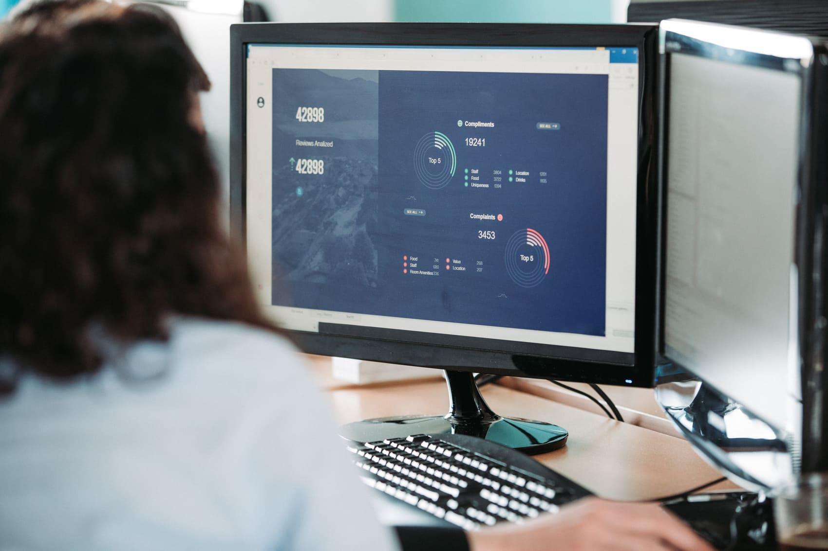
However, the efficacy of even the most advanced backend analytics hinges critically on its user interface. A poorly designed interface can negate the benefits of intelligent processing, leading to confusion, delayed responses, and user fatigue. Conversely, a well-crafted UI transforms complex data into intuitive visual cues, making critical real-time information immediately comprehensible and actionable. It’s about bridging the gap between data intelligence and human understanding.
Developing effective UI patterns for critical real-time information requires a deep understanding of human perception, cognitive load, and the specific operational context. It involves decisions about color schemes, iconography, notification types, and the overall layout of dashboards. The aim is to create an experience where users can quickly grasp the severity and nature of an event, understand its potential impact, and identify the necessary steps to address it without undue effort or interpretation.
The ability to present vital information clearly and concisely directly impacts operational efficiency and organizational resilience. When teams can effortlessly monitor key performance indicators and receive timely, relevant alerts, they are better equipped to maintain optimal system health, minimize disruptions, and ensure continuous service delivery. This proactive stance is essential for sustained operational excellence and competitive advantage in any sector relying on dynamic data.
FrovidAkert understands these complexities deeply, focusing on innovative solutions that translate intricate data streams into clear, actionable insights through superior interface design. Our approach emphasizes user-centric patterns that reduce cognitive load and accelerate decision-making, ensuring that critical real-time information is always presented in the most effective manner possible. We believe that clarity in data presentation is paramount for operational success.
Applications and Considerations
-
IT Operations: Alerts on system anomalies and performance. Pros: Fast response, less downtime. Limitations: Risk of alert fatigue if thresholds are not precisely tuned.
-
Industrial Control: Monitors production parameters. Pros: Improved safety, process stability. Limitations: Complex integration of diverse legacy systems, ensuring data integrity.
-
Logistics & Supply: Tracks assets, inventory, and deliveries. Pros: Optimized resource use, better delivery. Limitations: Data synchronization challenges across varied vendors and locations.
Expert Perspectives on Interface Design for Critical Data
The debate among UI/UX experts often centers on the optimal balance between information density and visual simplicity in critical monitoring dashboards. Some advocate for minimalist designs, arguing that less is more when stakes are high. Their philosophy suggests that only the most critical data points should be immediately visible, with deeper details accessible on demand. This approach aims to prevent cognitive overload and ensure that users can quickly identify urgent issues without distraction, promoting faster decision processes. 
Conversely, other specialists argue for more comprehensive dashboards that provide a richer context at a glance. They contend that while simplicity is valuable, withholding too much information can lead to incomplete understanding or misinterpretation of an alert's true significance. Their designs often incorporate multiple data visualizations, trend lines, and related metrics, believing that a holistic view empowers more nuanced and effective problem-solving, even if it initially presents more visual elements to process.
A significant point of convergence, however, is the importance of contextual intelligence embedded within the alert system itself. It's not enough for an alert to merely state "System X is down." A truly smart alert should also provide immediate context, such as "System X is down, affecting service Y, likely due to recent update Z." This additional layer of information transforms a raw notification into an actionable insight, significantly reducing the time spent on initial investigation and diagnosis, thereby accelerating resolution times and enhancing operational flow.
Another area of discussion revolves around the personalization versus standardization of alert configurations and UI layouts. While standardized patterns ensure consistency and reduce training overhead, personalization allows individual users or teams to tailor their monitoring experience to their specific roles and responsibilities. Finding the right balance involves designing flexible frameworks that offer robust defaults while enabling controlled customization, ensuring both consistency across the organization and relevance for individual users.
The future trajectory of smart alerts and monitoring interfaces is increasingly pointing towards predictive analytics. Moving beyond reactive notifications, the next generation of systems aims to anticipate potential issues before they manifest. This involves leveraging machine learning to identify subtle patterns and anomalies that indicate an impending problem, allowing for proactive interventions. The UI for such systems must evolve to effectively communicate these probabilistic insights, balancing urgency with the inherent uncertainty of predictions.
Final Observations and Recommendations
Effective interfaces for critical real-time information are paramount. Prioritizing systems that detect and present issues for immediate understanding enhances operational resilience. Thoughtful UI/UX is key.
A user-centric design, with continuous feedback, minimizes cognitive load and alert fatigue. FrovidAkert advances intelligent interfaces, ensuring clarity and control over vital operational data, transforming potential chaos into informed action.
Comments 6